
Mean Median Mode: How to Understand Survey Results

Survey results can tell you what customers like, what staff need, and where a business can improve. But a long list of answers is hard to read. That is where the mean, median, and mode can help.
These three measures show the average, the middle value, and the most common answer. Each gives you a different view of your data. For example, a high average score may look good at first. Yet a few low ratings could point to a problem worth fixing.
Before you do the math, make sure your questions are clear. This guide to getting useful survey results can help you plan your survey.
Below, you will learn how to find each measure, choose the right one, and use the results to make better decisions.
What Are Mean, Median, and Mode?
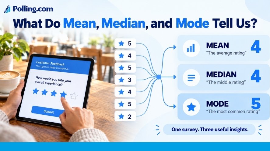
Mean, median, and mode are measures of central tendency. In plain terms, they help describe the center of a set of answers.
- Mean: The average of the numbers.
- Median: The middle value after you put the numbers in order.
- Mode: The answer that appears most often.
They may give the same result. But they can also tell very different stories. The NIST guide to these measures explains why they differ. Your best choice depends on the question and the spread of the answers.
Mean: Find the Average
The mean is the total of all the numbers divided by how many numbers you have.
Mean = Sum of values ÷ Number of values
Say five customers rate a service from 1 to 5. Their scores are:
4, 5, 3, 4, 4
Add the scores: 4 + 5 + 3 + 4 + 4 = 20. Then divide by five.
Mean = 20 ÷ 5 = 4
The average rating is 4 out of 5.
The mean works well when you want an overall figure for numeric data. Still, very high or low values can pull it away from what most people report.
Median: Find the Middle Value
The median is the middle number in a list sorted from low to high. It often gives a better sense of a typical value when a few answers are far from the rest.
Imagine five customers report how much they spend in a month:
$20, $30, $35, $40, $250
The middle amount is $35, so the median is $35. The mean is $75 because the $250 amount raises the average.
What if you have an even number of values? Take the two middle numbers and find their mean.
For $20, $30, $40, $50, the median is ($30 + $40) ÷ 2 = $35.
The median is useful for spending, income, and wait times. It can also show the middle response on an ordered rating scale.
Mode: Find the Most Common Answer
The mode is the answer that appears more often than any other answer. Unlike the mean, it also works with words and other categories.
Say ten people choose their favorite way to get support:
| Support channel | Number of answers |
|---|---|
| 5 | |
| Chat | 3 |
| Phone | 2 |
Email is the mode. It is the most popular choice in this group.
A set can have two modes if two answers tie for the top count. It can have more than two as well. If each answer appears only once, there is no clear most common answer.
Keep in mind that the mode is not always a majority. The top choice might get just 40% of votes if each other choice gets less.
Mean vs. Median vs. Mode: Which Should You Use?
Use the measure that fits the question. Here is a quick guide.
| Measure | What it shows | Best used for | Watch out for |
|---|---|---|---|
| Mean | Average value | Sales amounts and numeric scores | Extreme values can change it |
| Median | Middle value | Spending, income, and ordered ratings | It can hide gaps between answers |
| Mode | Most common answer | Brand choices and rating categories | Ties may hide a clear winner |
See How One High Value Changes the Result
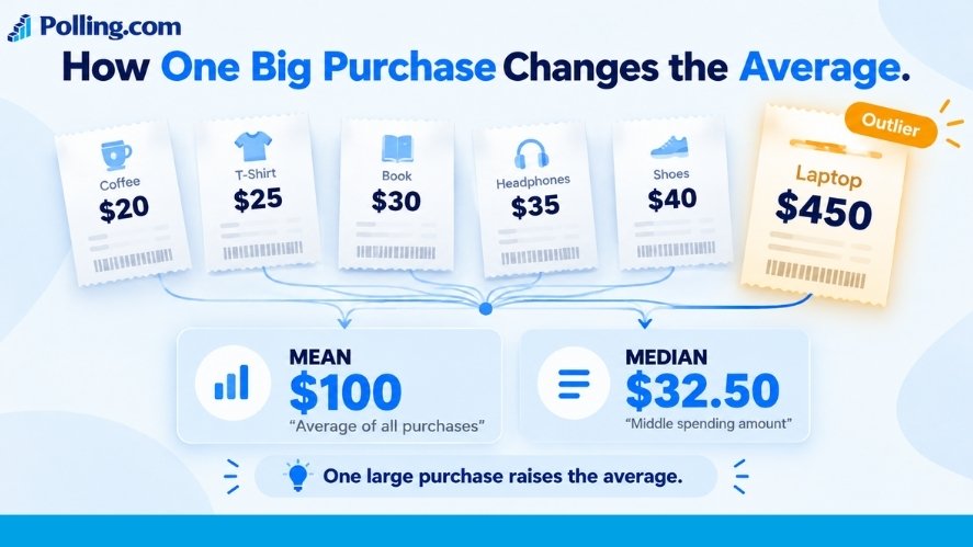
Suppose six shoppers report these purchase amounts:
$20, $25, $30, $35, $40, $450
The sum is $600. So the mean is $100. The median is $32.50, halfway between $30 and $35. No amount repeats, so there is no clear mode.
Five shoppers spent $40 or less. The one $450 purchase pulls the mean up.
Does that make the mean wrong? Not at all. If you need average sales per order, the mean helps. If you want to describe a typical shopper’s bill, the median tells you more.
Match the Measure to the Type of Question
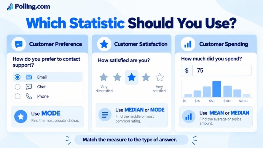
Some surveys ask for amounts. Others ask people to pick a label or rate how they feel.
- Names or categories: For a question such as “Which brand do you prefer?” use the mode and response shares. An average brand makes no sense.
- Ordered choices: For answers from “Very unhappy” to “Very happy,” use the median, mode, and counts for each choice.
- Amounts or counts: For money spent or days waited, check both the mean and median.
You can also assign numbers from 1 to 5 to a satisfaction scale and report the mean. Many teams do this. But it assumes the steps between choices are close enough to treat as equal. Show the response shares too, so readers can see the full picture.
How to Calculate Mean Median Mode in Survey Data
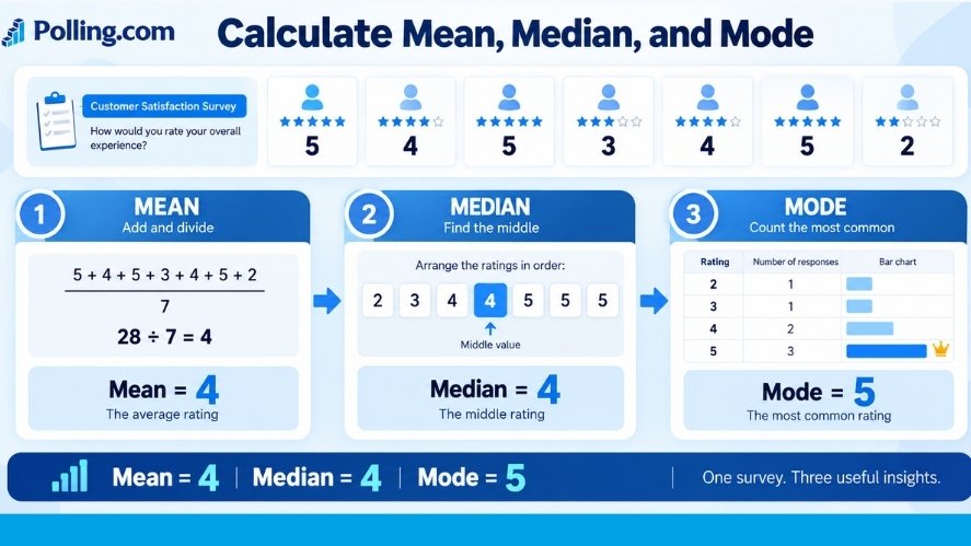
Let’s work through one set of scores. Seven people rate a service from 1 (very unhappy) to 5 (very happy).
Their answers are:
5, 4, 5, 3, 4, 5, 2
Step 1: Work Out the Mean
Add all seven ratings:
5 + 4 + 5 + 3 + 4 + 5 + 2 = 28
Then divide by seven:
Mean = 28 ÷ 7 = 4
The average score is 4 out of 5.
Step 2: Find the Median
Put the scores in order:
2, 3, 4, 4, 5, 5, 5
The fourth score sits in the middle. So the median is 4.
Step 3: Count the Mode
Now count each rating.
| Rating | Number of answers | Share of answers |
|---|---|---|
| 1 | 0 | 0% |
| 2 | 1 | 14% |
| 3 | 1 | 14% |
| 4 | 2 | 29% |
| 5 | 3 | 43% |
| Total | 7 | 100% |
A rating of 5 appears three times. So the mode is 5.
Step 4: Explain What the Scores Mean
| Measure | Result |
|---|---|
| Mean | 4 |
| Median | 4 |
| Mode | 5 |
| Valid answers | 7 |
The average score is 4. The middle score is also 4. Yet 5 is the most common answer.
This group seems pleased with the service, but two people gave a 2 or 3. Their comments may show what needs work.
One caution: Seven answers are not enough to tell you what all customers think. Treat this as an example, not proof of a wider trend.
How Businesses Use These Measures
These basic tools can help you read many kinds of survey results. Here are four common uses.
Customer Satisfaction
A business may track its average service rating each month. It can also check the median and most common rating.
Say the mean rises from 4.1 to 4.4. That may be a good sign. But first check the sample size, the mix of customers, and the share of low scores. Otherwise, you might miss a problem behind the higher average.
Employee Feedback
Staff may rate how much support they get at work. The median can show the middle answer, while the mode shows the most common view.
Still, don’t stop there. If most staff choose “Agree” but one team often picks “Disagree,” that team may need help. Protect staff privacy when you review small groups.
Market Research
A brand might ask which feature people value most: price, comfort, design, or ease of use.
The mode shows the top choice. The share for each option adds context. If the survey also asks how much people plan to spend, the mean and median can help with pricing research.
Net Promoter Score Surveys
Net Promoter Score (NPS) uses a 0–10 question about how likely a person is to recommend a company.
The three groups are:
- Promoters: 9–10
- Passives: 7–8
- Detractors: 0–6
As Bain explains, the formula is:
NPS = % of promoters − % of detractors
For example, 60% promoters and 20% detractors give an NPS of +40.
The mean, median, and mode can help describe those 0–10 ratings. But none of them is the NPS score. To learn what drives the scores, ask NPS follow-up questions.
Common Mistakes to Avoid
Even correct math can lead to the wrong takeaway. Watch for these errors before you share your results.
Relying on the Mean Alone
One very large value can raise the mean by a lot. If your data has a few extreme answers, report the median too. A chart can also show how the numbers are spread out.
Averaging Labels That Have No Order
You cannot find a useful average of brand names or colors. Even if you give each brand a number, those codes are just labels. Use counts, shares, and the mode instead.
Counting Missing Answers as Zero
Imagine 200 people take a survey, but only 165 answer the spending question. Use the 165 valid amounts to find the mean, not all 200 people. Don’t treat blank answers as zero unless zero is the real answer.
Always show how many people answered each question. This makes it easier for readers to judge the findings.
Ignoring Who Took the Survey
An accurate average does not make a sample fair. If only your happiest customers reply, the scores may not reflect the views of all customers.
Also check how you wrote the questions. Leading or vague wording can change the answers. For help, see these survey design tips.
How to Analyze Survey Results With Polling.com and Excel
You don’t need advanced tools to start. A clear survey and a simple spreadsheet can go a long way.
Collect Clear Answers With Polling.com
Start with one goal. Do you want to learn how customers feel, how much they spend, or which product they prefer?
Next, choose a question type that matches your goal. A 1–5 rating works for satisfaction. A choice of brands works for preference. An amount field works for spending.
Polling.com lets you create surveys and review responses. Its survey export guide also shows how to download answers as CSV or JSON files. You can then use a spreadsheet to check the results in more detail.
Before you send your survey, test it. Make sure the wording is clear and each answer choice fits the question.
Calculate the Results in Excel
Put the seven example ratings in cells B2:B8. Then use these formulas:
| What to find | Excel formula |
|---|---|
| Mean | =AVERAGE(B2:B8) |
| Median | =MEDIAN(B2:B8) |
| One mode | =MODE.SNGL(B2:B8) |
For this set, Excel returns 4, 4, and 5.
MODE.SNGL works with numbers, not text labels. It gives one mode if there is a tie and returns #N/A if no number repeats. For text answers, make a count table instead.
Microsoft’s MODE.SNGL guide explains how the function works.
Pick a Chart That Fits the Answers
A chart can show details that one number misses:
- Bar chart: Compare brands, choices, or rating counts.
- Histogram: Show how amounts, ages, or wait times spread across ranges.
- Box plot: Show the median, spread, and possible extreme values for numeric data.
Keep labels clear. Show the number of valid answers. If you’re making a report for your team, this guide to presenting survey results can help.
Best Practices for Reading Survey Data
Before you make a decision, run through this short check:
- Pick the right measure. Use the mean for a numeric average, the median for the middle, and the mode for the top choice.
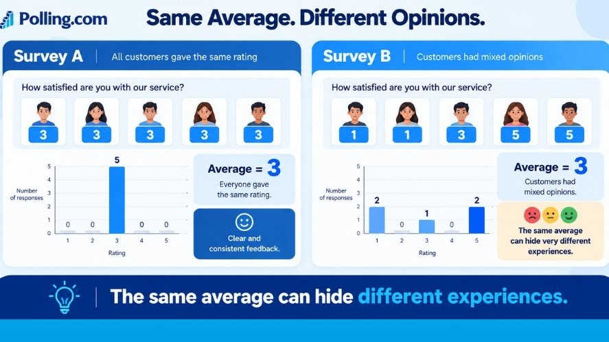
- Check all the answers. Look at the counts and spread, not just one score.
- Show your sample size. State how many valid answers each figure uses.
- Compare like with like. Use the same question and scale when you compare survey rounds.
- Check groups with care. A total score may hide problems in one team or customer group.
- Explain the finding in plain words. Say what the numbers show and what still needs more research.
For example, don’t just report “Mean: 4, Median: 4, Mode: 5.” Tell readers that the scores lean positive, yet some people had a worse experience. Then point to the next question you want to answer.
Frequently Asked Questions
What Is the Difference Between Mean, Median, and Mode?
The mean is the average. The median is the middle value after sorting the numbers. The mode is the most common value or answer.
How Do You Calculate Mean, Median, and Mode?
Add the numbers and divide by the count to find the mean. Sort them to find the median. Count how often each answer appears to find the mode.
Is Mean or Median Better for Survey Results?
It depends. The mean is useful when the average matters. The median often shows a more typical value when a few numbers are very high or low. For many sets of numbers, show both.
Can a Survey Have More Than One Mode?
Yes. For 2, 2, 3, 4, 4, 5, both 2 and 4 appear twice. The set has two modes.
Can I Use the Mode for Rating-Scale Questions?
Yes. It shows which rating people choose most often. The median is also useful for ordered choices. Show each rating’s share to avoid hiding split views.
Why Do These Measures Matter in Research?
They turn a long list of answers into useful summaries. Still, they cannot prove why people feel a certain way or show that every person in a larger group agrees.
Conclusion
Mean, median, and mode are easy to calculate, but each serves a different purpose. The mean shows the average. The median shows the middle. The mode shows the most common answer.
Use the one that suits your survey question. Then check the full range of answers, the sample size, and who took part. That extra care can help you avoid false conclusions.
Ready to put these ideas to use? Create a survey with Polling.com, gather clear answers, and choose the right way to read your results.