
How to Present Survey Results That Drive Better Decisions
Understanding how to present survey results is important if you want to turn feedback into useful insights. Many organizations collect large amounts of data from surveys. However, raw data alone is not very helpful. It becomes valuable only when it is organized, analyzed, and explained clearly.
Businesses, researchers, and marketers often conduct a survey to learn what customers think, measure satisfaction, or test new ideas. Still, collecting survey responses is only the first step. If the results are not presented clearly, the data can be hard to understand. In some cases, it can even lead to the wrong conclusions.
Because of this, presenting survey data requires a clear structure. It also requires simple visuals and clear explanations. You might be working with a feedback form, internal research, or insights from a customer feedback platform. Regardless of where the data comes from, the objective remains the same. You need to turn numbers into insights that people can quickly understand and use.
In this guide, you will learn how to present survey results step by step. You will also see common visualization methods, reporting tips, and modern survey tools that make the process easier.
Why Presenting Survey Results Properly Matters
Presenting survey data correctly helps organizations understand what their audiences truly think. Raw numbers alone rarely tell a clear story. Instead, survey data needs context, explanation, and structure.
When teams clearly communicate their survey and results, stakeholders can make better decisions, identify trends, and respond to feedback faster.
Turning Raw Data Into Actionable Insights

First, surveys help organizations gather valuable information from respondents. This information might relate to product satisfaction, employee engagement, or market research.
However, raw survey responses often include hundreds or even thousands of data points. Without analysis, the information is difficult to interpret.
Once results are structured and visualized, organizations can identify patterns such as:
- Customer satisfaction trends
- Feature requests or complaints
- Employee engagement levels
- Market preferences
For example, companies using customer feedback tools can detect product issues quickly by analyzing trends across multiple responses.
Additionally, businesses often combine survey insights with survey benchmarks to compare their results with industry averages. This helps them determine whether their performance is strong or needs improvement.
Improving Stakeholder Understanding
Another reason presentation matters is communication.
Executives and decision makers rarely have time to review raw datasets. Instead, they rely on clear summaries, visuals, and conclusions.
A strong survey results presentation makes insights easier to understand by highlighting:
- Key trends
- Important percentages
- Comparisons across groups
- Major conclusions
For example, a marketing team may present customer insights gathered from a user feedback platform. Instead of sharing thousands of responses, they present a visual summary showing the top concerns and most requested features.
As a result, stakeholders can quickly understand the findings.
Increasing Trust in Survey Data
Clear reporting also builds credibility.
When organizations present their survey results transparently, audiences trust the conclusions more. This includes explaining how the survey was conducted, how many participants responded, and what type of questions were asked.
For example, reports should clarify:
- Total number of respondents
- The survey response rate
- The types of surveys used
- The types of survey questions included
Being transparent helps maintain the accuracy and credibility of survey insights.
Step by Step Guide on How to Present Survey Results
Knowing how to present survey results requires more than just charts. The process starts long before the presentation itself.
Below is a simple framework that organizations can follow.
Step 1: Define the Objective of the Survey
Before analyzing results, it is important to understand the purpose of the research.
Many people ask, what type of research is a survey? In simple terms, surveys are a quantitative research method used to collect structured feedback from a group of people.
However, every survey should have a clear objective.
Common goals include:
- Measuring customer satisfaction
- Testing product ideas
- Evaluating employee engagement
- Collecting marketing insights
For example, when companies create survey campaigns for customers, they often want to understand product usage or satisfaction.
Understanding the goal helps determine which results should be highlighted in the final report.
Step 2: Clean and Organize Your Data
Next, the dataset must be cleaned.
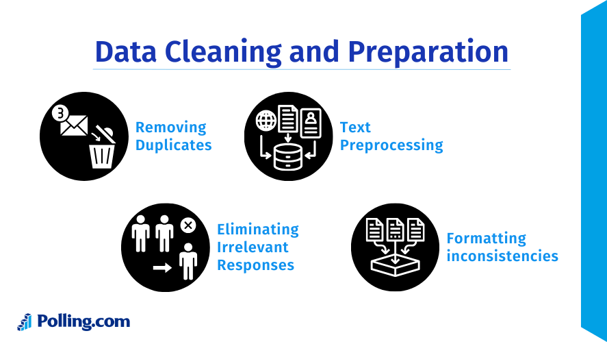
Not every response collected during a survey will be useful. Some respondents might skip questions, submit incomplete answers, or provide duplicate entries.
Before presenting data, researchers should:
- Remove incomplete responses
- Identify duplicates
- Filter out invalid answers
- Verify response accuracy
This step ensures that the survey and results are reliable.
Step 3: Identify Key Findings
Once the data is organized, the next step is to find the most important insights.
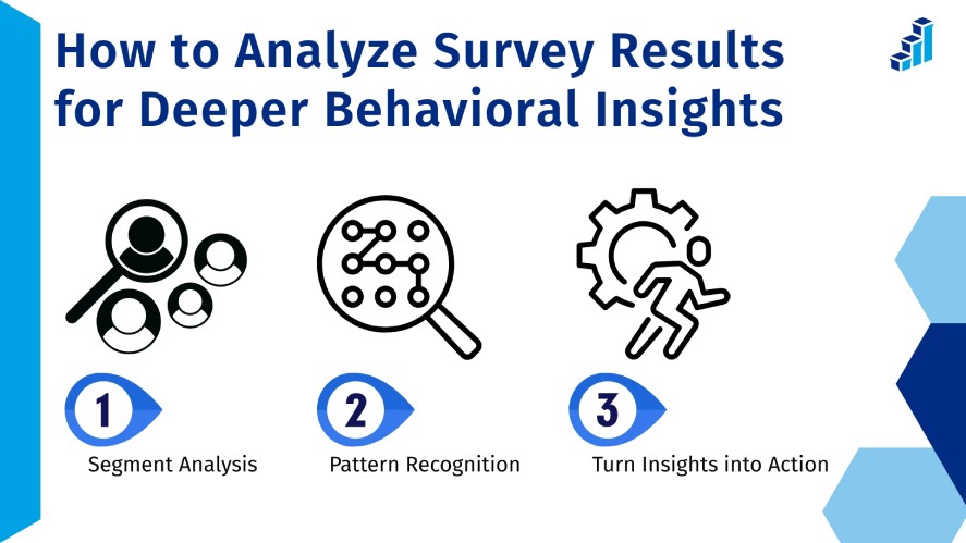
One common mistake when presenting survey results is trying to show every data point. Instead, focus on the findings that answer the main research question.
Key insights might include:
- The most common customer complaint
- The most requested product feature
- Satisfaction score trends
- Differences between demographic groups
For example, if a company wants to increase survey response rate, it may analyze feedback about survey length or usability.
Highlighting key findings makes the presentation easier to understand.
Step 4: Choose the Right Visualizations
Visualizations play a major role in how to present survey results effectively.
Charts allow audiences to interpret data quickly without reviewing large tables.
Common chart types include:
Bar Charts
These are ideal for comparing multiple categories. For example, they can display answers to multiple-choice polling questions.
Pie Charts
Pie charts show proportions. They work well when presenting the percentage of respondents selecting each answer.
Line Charts
Line charts are commonly used to display patterns or changes across a period of time. They help organizations track changes in satisfaction or engagement.
Heat Maps
Heat maps highlight patterns in complex datasets. They are often used in large research reports.
Choosing the right chart type makes insights easier to understand.
Step 5: Provide Context for the Results
Numbers alone rarely explain the full story.
When presenting survey data, it is important to provide context. This includes explaining why the results matter and how they compare with expectations or survey benchmarks.
For example:
- Is the satisfaction score above or below industry averages?
- Did engagement improve compared with previous surveys?
- Are certain groups more satisfied than others?
Providing context ensures the audience understands the meaning behind the numbers.
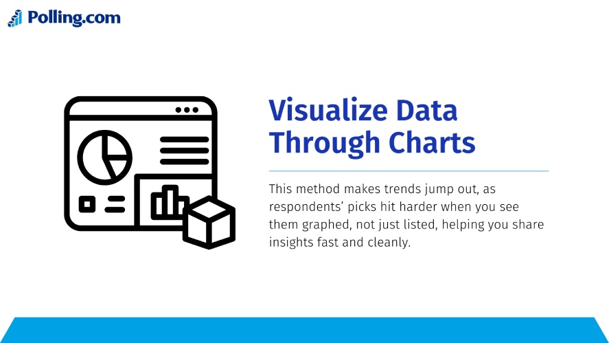
Best Ways to Present Survey Results Visually
Visual communication makes survey findings easier to understand. When used correctly, visuals help audiences quickly interpret patterns and insights.
Using Charts and Graphs
Charts are the most common way to present survey results.
Different types of charts work best for different types of data.
For example:
- Bar charts are useful for multiple-choice answers
- Pie charts show distribution percentages
- Line charts show changes over time
- Stacked charts show comparisons between groups
Charts also work well when showing survey questions example responses. For instance, customer satisfaction scores can be displayed visually so stakeholders immediately see trends.
Using Tables for Detailed Data
While charts simplify data, tables are useful for precise numbers.
Tables help when audiences need exact values instead of visual summaries.
For example, a report may include tables showing:
- Number of responses per question
- Breakdown by demographic group
- Detailed ratings or scores
Tables are often included alongside visuals in a professional survey results presentation.
Using Infographics for Quick Insights
Infographics are another effective way to present findings.
A survey results infographic summarizes the most important insights in a visually appealing format. This approach is especially useful for marketing materials or executive summaries.
An infographic survey results layout might include:
- Key statistics
- Short explanations
- Simple charts
- Visual icons
Organizations often combine data and visuals using a survey results template to make infographic creation easier.
Infographics work well for presentations, reports, and social media sharing.
Tools That Help You Present Survey Results Better
Technology has made survey reporting much easier. Modern platforms help organizations collect data, analyze responses, and generate reports automatically.
Many organizations rely on specialized survey tools to manage the entire research process.
Polling.com

Polling.com is designed to simplify both survey creation and reporting.
Users can easily create survey projects, collect responses, and generate visual reports. The platform includes intuitive dashboards that display insights in real time.
Some advantages include:
- Easy survey creation
- Real time analytics
- Clear visual dashboards
- Exportable reports
- Simple data summaries
Polling.com also supports features that help organizations increase survey response rate. For example, surveys can be optimized for usability and accessibility, which encourages more participants to complete them.

Because of these features, the platform works well as a customer feedback platform or user feedback platform for companies collecting product or service feedback.
Other Survey Tools
Several other platforms are also widely used for surveys.
Examples include:

A well known survey platform with advanced analytics and reporting capabilities.
Typeform focuses on conversational surveys that improve engagement and user experience.
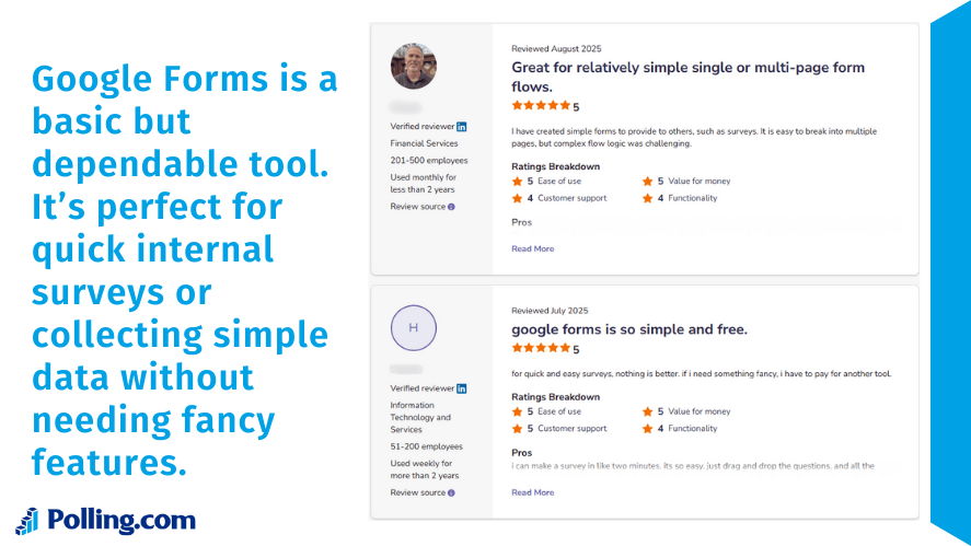
Google Forms is a free option that allows users to create simple surveys quickly.
While these platforms are useful feedback tools, some organizations prefer solutions focused on reporting clarity and data insights.
In many cases, companies combine multiple customer feedback tools to collect and analyze feedback from different sources.
Common Mistakes When Presenting Survey Results
Even well designed surveys can produce confusing reports if the results are presented poorly.
Below are some common mistakes to avoid.
Overloading Audiences With Too Much Data
One of the most frequent problems is including too many charts or statistics.
Large datasets can overwhelm readers, especially when every question is displayed in detail.
Instead, focus on the most meaningful insights. Highlight the findings that answer the survey’s core objective.
Ignoring Key Insights
Another mistake is presenting numbers without interpretation.
For example, showing that 65 percent of respondents prefer a feature is helpful. However, the presentation should also explain why that finding matters.
Insights should answer questions such as:
- What does this trend indicate?
- How should the organization respond?
- What actions should be taken?
This approach turns raw numbers into useful knowledge.
Misleading Visualizations
Incorrect chart design can also distort results.
For example:
- Using the wrong chart type
- Manipulating axis scales
- Presenting percentages without context
Clear and accurate visuals ensure that audiences interpret the data correctly.
Best Practices for Reporting Survey Results
Following best practices can improve the clarity and impact of survey reports.
Focus on the Most Important Metrics
When presenting findings, highlight metrics that matter most.
These may include:
- Satisfaction scores
- Net promoter scores
- Percentage of positive responses
- Key trends across groups
Focusing on the most meaningful data helps stakeholders quickly understand the main insights.
Use Clear Labels and Descriptions
Charts and graphs should always include clear labels.
Each visualization should explain:
- The survey question
- The number of respondents
- The percentage or count of responses
This ensures that audiences understand the data without confusion.
Tell a Story With the Data
Finally, effective presentations follow a logical narrative.
Instead of showing random charts, organize the report in a way that guides readers through the insights.
A typical structure may include:
- Survey objective
- Overview of participants
- Key findings
- Detailed results
- Conclusions and recommendations
Storytelling makes survey insights easier to remember and act upon.
Conclusion
Knowing how to present survey results helps turn raw data into useful insights. Surveys provide valuable feedback from customers, employees, and research participants. However, raw numbers alone rarely help people make decisions.
Instead, organizations need to organize their survey and results in a clear way. They should highlight the most important insights and support them with simple visuals.
After cleaning the data and identifying key patterns, teams can turn large datasets into clear reports. Visual elements such as charts, tables, and a survey results infographic help readers understand the findings faster.
Modern survey tools, including platforms like Polling.com, make this process much easier. These platforms help teams collect feedback, analyze responses, and present results clearly. They also support the full process, from creating survey questions to sharing the final report.
In the end, a strong survey results presentation combines accurate data, simple visuals, and clear explanations. When survey results are presented well, organizations can better understand their audience, improve their products or services, and make smarter decisions.