Comparative Analysis For Before vs. After Surveys
In survey analytics, comparative analysis is a powerful method for uncovering changes over time by directly comparing two sets of data.
One of the most effective forms of this approach is the before vs. after survey.
It’s a method where you collect feedback prior to an event, intervention, or product launch, and then repeat the same survey afterward. This allows you to clearly see what changed, how much it changed, and why.
Whether you’re tracking customer experience before and after introducing a new feature, measuring employee engagement following a training program, or gauging public opinion during a political campaign, before/after surveys provide concrete, actionable insights.
Unlike standalone surveys that offer a snapshot, this method helps you measure growth in impact, investigating the effectiveness of decisions and refining future strategies.
From product feedback platforms to customer experience management tools, businesses and organizations are increasingly using comparative analysis to validate results, minimize guesswork, and make confident, data-driven decisions.
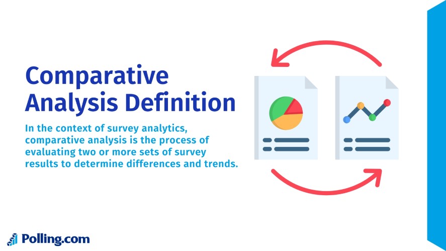
What is Comparative Analysis in Surveys?
In the context of survey analytics, comparative analysis is the process of evaluating two or more sets of survey results to determine differences and trends.
With before/after surveys, the comparison is temporal. You measure the same audience at two distinct points in time to assess the impact of a change.
This method fits within the broader scope of analytical survey methods, but it differs from other approaches.
Cross-sectional surveys capture data at a single point in time, offering a snapshot but no direct measure of change. Or trend analysis looks at data over multiple points in time, often across different audiences, to spot long-term patterns.
Before vs. after comparative analysis, however, focuses on the same audience before and after a specific event. This makes it more effective for isolating the effects of a particular action, campaign, or intervention.
By maintaining consistent question wording, scales, and sampling methods, comparative analysis ensures that differences in results are due to actual changes in behavior, sentiment, or awareness, not inconsistencies in survey design.
Understanding Before vs. After Surveys
Before and after surveys work as a paired data set, one snapshot taken before an event or intervention, and another after it. Together, they show how much has changed and in which direction.
The “Before” Phase
The first phase establishes your baseline. By collecting data ahead of a campaign, product launch, or policy change, you gain a clear picture of the starting point.
Typical metrics to capture in this phase include:
- Customer Satisfaction: current ratings on products or services.
- Brand Awareness: how well your audience recognizes your brand or offering.
- Sentiment: the tone of opinions or attitudes expressed by respondents.
- Behavior: actions such as purchase frequency, usage patterns, or engagement levels.
Strong baseline data ensures you have something meaningful to compare against later.
The “After” Phase
Once the change has been introduced, the “after” survey reveals how those efforts have influenced your audience.
The key is to compare results against the baseline from the “before” phase. This makes it easier to spot meaningful shifts rather than random fluctuations.
The timing of this survey can shape what you discover.
Conducting it immediately after the change captures fresh impressions and short-term reactions, which is useful for measuring immediate engagement or excitement.
Waiting several weeks or months, on the other hand, can highlight whether those effects last or fade. It can also reveal slower, more sustained changes in behavior.
To ensure that differences in the results reflect actual impact rather than changes in measurement, the survey should mirror the “before” phase as closely as possible, using the same questions, scales, and target audience.
This consistency keeps the comparison clean and strengthens the credibility of your conclusions.
How Comparative Analysis Improves Insights
Before-and-after data is powerful on its own, but the real value comes from digging into the key differences and similarities. Comparative analysis helps you move beyond raw numbers to understand what truly drove the change.
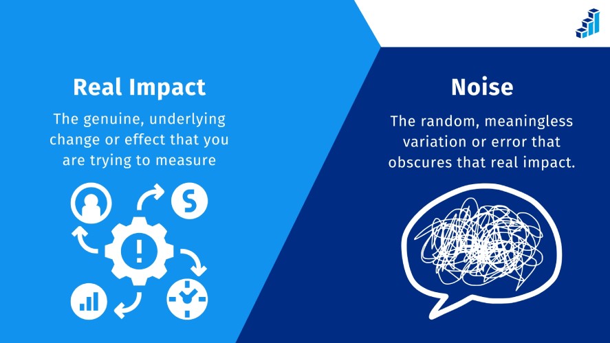
Identifying Real Impact vs. Noise
A side-by-side look at “before” and “after” results can reveal whether a change truly moved the needle or if the shift is just background noise.
The key is isolating what actually changed between the two periods.
For example, if sales improved after a marketing push, you’ll want to check whether that boost coincided with seasonal buying habits, competitor issues, or other unrelated factors.
By filtering out those external influences, you can focus on the direct impact evaluation of your campaign, training program, or product update, rather than being misled by coincidental trends.
Quantifying Change with Statistical Significance
Once you’ve identified a likely cause-and-effect relationship, the next step is confirming that the difference is real and not a fluke.
Statistical tools and quantitative analysis techniques like t-tests, percentage change calculations, and confidence intervals help determine whether the shift is meaningful.
But numbers alone aren’t enough. The accuracy depends on collecting data from a sample that’s large and consistent enough to represent your target audience.
Without that foundation, even the most sophisticated calculations can give a false sense of certainty. A well-structured comparative analysis turns raw shifts into reliable insights, ensuring your decisions rest on solid ground.
Best Practices for Running Before vs. After Surveys
To get accurate, actionable results from a before-and-after survey, it’s not enough to simply ask questions twice; you need to design the process so both sets of data speak the same language.
That means paying close attention to question consistency, timing, and the tools you use.
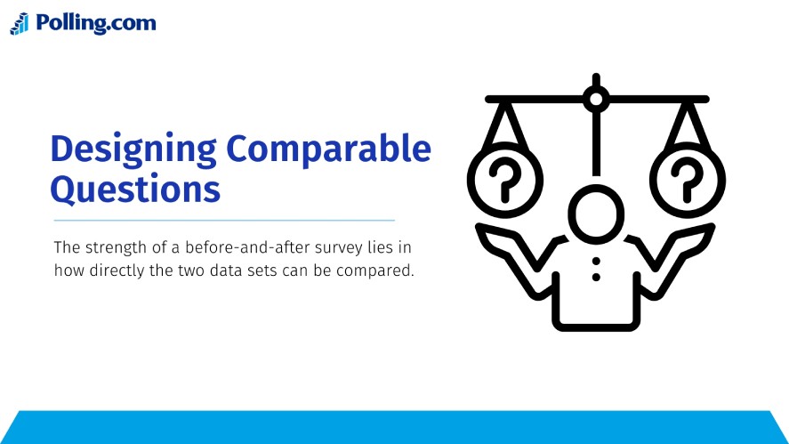
Designing Comparable Questions
The strength of a before-and-after survey lies in how directly the two data sets can be compared.
If the wording changes even slightly, you risk introducing bias that makes the results harder to interpret.
Likewise, using the same measurement scale, such as a 5-point Likert scale, ensures that a “4” in the first survey means the same thing in the second.
This uniformity allows you to focus on what truly changed in respondents’ attitudes or behaviors, rather than wondering whether a difference in phrasing is skewing the results.
Timing and Frequency
The timing of your “after” survey can make or break the insights you gather.
Conduct it too soon, and you might only capture an initial burst of enthusiasm before the dust has settled. Wait too long, and the effect you’re trying to measure could fade, or be overshadowed by unrelated events.
The optimal timing depends on your objective: a marketing campaign might be evaluated within days, while a workplace training program could require weeks or months before its impact becomes clear.
In either case, keeping an eye on potential external influences, like seasonal trends or industry news, helps prevent skewed data.
Choosing the Right Survey Tool
The right platform can simplify every stage of the before-and-after process.
Polling.com, for example, offers built-in analytics that track change over time, side-by-side visualizations for quick performance comparisons, and customizable templates specifically designed for pre-surveys and post-intervention surveys.
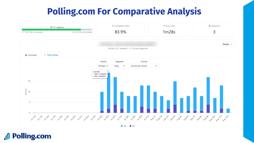
These features make it easier to interpret results without heavy data wrangling.
While alternatives like SurveyMonkey and Google Forms can handle comparative surveys, they often require more manual setup and analysis to achieve the same level of clarity.
In comparative research, the less friction in your tools, the more focus you can give to the insights themselves.
Real-World Applications of Comparative Analysis
Comparative analysis turns before and after snapshots into actionable insights. By framing changes in context, it helps separate assumptions from measurable outcomes.
A customer support team might measure satisfaction scores before rolling out a new chatbot. Then, compare them afterward to confirm if automation actually improves the experience.
In a corporate setting, HR could gauge engagement levels before and after introducing a four-day workweek, revealing whether shorter schedules boost productivity or just shift workloads.
The same logic applies to politics and marketing. Pollsters often track voter sentiment before and after televised debates to see if key talking points sway public opinion.
Marketers, meanwhile, can assess brand awareness before launching an ad campaign and again after it runs to determine its true reach.
From business strategy to public perception, this approach turns raw data into clear evidence of what’s working and what’s not, making it an invaluable tool for market trend analysis strategies.
Common Pitfalls in Comparative Analysis and How to Avoid Them
Even well-planned before-and-after surveys can fall short if certain mistakes creep in. Recognizing these pitfalls early makes it easier to design surveys that produce reliable, actionable results.
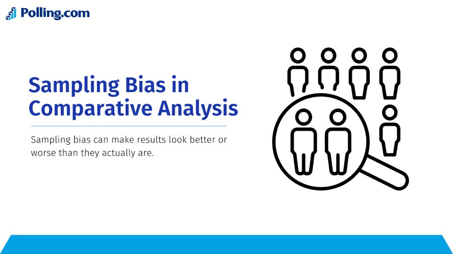
Sampling Bias in Comparative Analysis
Sampling bias happens when the group you survey before the change isn’t truly comparable to the group you survey after. This mismatch can make results look better or worse than they actually are.
For instance, if your “before” survey includes a wide range of customers, but your “after” survey is mostly answered by loyal repeat buyers, you’ll likely see inflated satisfaction scores.
The opposite can also happen. If your after-survey audience is dominated by new or dissatisfied customers, improvements may seem to fail even if they worked.
To avoid this, maintain consistency in how you recruit participants for both surveys. Use the same distribution channels, target the same demographics, and aim for similar sample sizes.
If you can survey the exact same individuals in both phases, that’s ideal. But when that’s not possible, strive for closely matched groups in terms of location, age, purchase history, or other relevant traits.
Poorly Timed “After” Surveys
Timing directly affects the validity of your results.
Send the after-survey too soon, and you risk capturing only immediate emotional reactions, such as post-launch excitement, rather than long-term impact.
Wait too long, and the change’s influence may fade, be forgotten, or become muddled by unrelated events like market shifts, competitor actions, or seasonal trends.
The right timing depends on the type of change you’re evaluating.
For a one-day event, sending the survey within 24–48 hours can capture fresh impressions while they’re still vivid.
For ongoing initiatives, it’s often better to wait several weeks or even months to gauge sustainable effects.
In either case, plan your timeline during the design phase so you’re not guessing when the time comes.
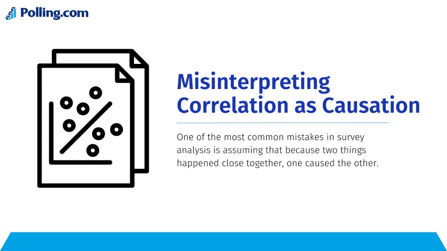
Misinterpreting Correlation as Causation
One of the most common mistakes in survey analysis is assuming that because two things happened close together, one caused the other.
A jump in employee satisfaction after a new benefits package might be caused by that change.Or, it could be due to unrelated factors, like a leadership change or seasonal bonuses.
Similarly, a drop in sales after a product redesign could be driven by economic conditions, not the redesign itself.
To reduce this risk, cross-check your findings against other data sources, such as sales reports, customer support logs, or market research.
Where possible, introduce control groups that do not experience the change. If they show similar trends, your change may not be the true cause.
Statistical tools like regression analysis can also help isolate the influence of individual variables.
Conclusion
Before and after surveys are more than just a way to measure change; they’re a powerful lens for understanding what’s truly working and what isn’t.
By applying comparative analysis, you can uncover trends, validate the impact of initiatives, and make decisions backed by solid evidence instead of guesswork.
Whether you’re tracking customer satisfaction, employee engagement, or campaign effectiveness, the principles remain the same: design with consistency, time your surveys thoughtfully, and interpret your results with care.
If you’re ready to see the full potential of pre and post surveys, try Polling.com survey tools for your next project.
With built-in analytics, side-by-side comparisons, and customizable templates, it’s designed to make comparative analysis both simple and insightful.