R² in Survey Analysis: What It Is and Why It Matters
Ever wonder how much your survey analysis results actually explain customer behavior?
The R² in survey analysis, or coefficient of determination, measures how well your survey data predicts outcomes, helping you spot meaningful patterns in data analysis.
For instance, it can show if customer satisfaction drives loyalty in your market survey analysis, guiding smarter business decisions.
By understanding the R squared value, you can boost the accuracy of your analysis of survey data, ensuring your insights lead to actions that hit the mark, no stats degree needed.
What Is R² in Simple Terms?
What is R squared? It’s a number between 0 and 1 that shows how much one variable (like satisfaction) explains changes in another (like purchases) in survey analysis.
The R squared formula, R² = 1 – (Sum of Squared Residuals / Total Sum of Squares), compares how well your data fits a regression line. Closer to 1 means a stronger fit.
Unlike the correlation coefficient (r), which only measures linear relationships, R² captures the proportion of variance explained, so an R² of 0.8 means 80% of loyalty changes tie to satisfaction.
For example, in a market survey of 200 customers, asking “How satisfied are you?” (1–5) vs. “How often do you buy?” (times/month) might yield an R² of 0.75, showing satisfaction strongly predicts purchases.
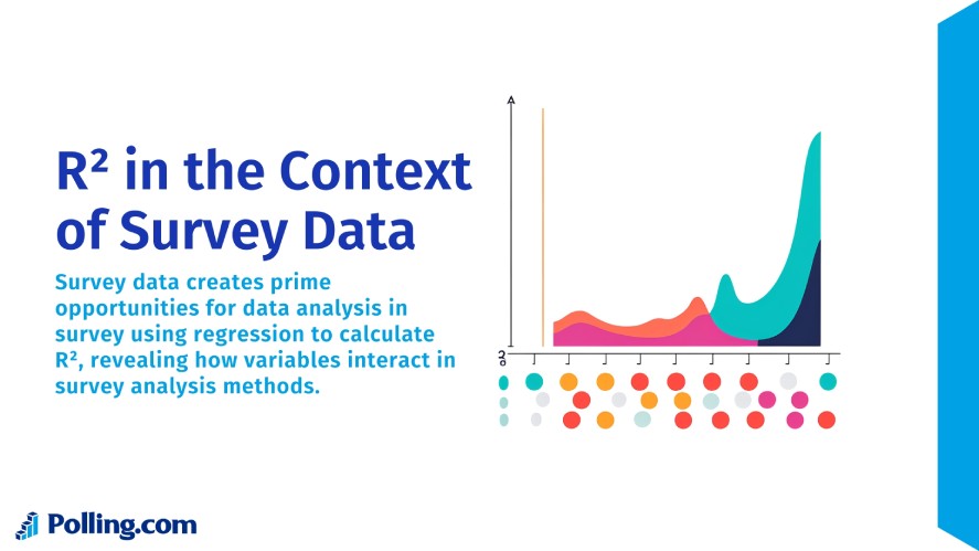
R² in the Context of Survey Data
Survey data creates prime opportunities for data analysis in survey using regression to calculate R², revealing how variables interact in survey analysis methods.
Questions like “How likely are you to recommend us?” (NPS, 0–10) or “How easy is our website?” (1–5) generate numerical results, linking responses to outcomes like retention.
In quantitative surveys, R² shows predictive strength, while in mixed-method surveys, combining ratings with open-ended feedback, adjusted R squared refines accuracy by accounting for multiple variables.
It ensures your survey data is robust and actionable.
Real-World Applications of R² in Survey Research
R² is a powerful tool in survey analysis. It helps researchers quantify how well one variable predicts another, turning raw survey data into actionable insights.
Let’s explore how it works across different survey contexts.
Customer Experience & NPS
In customer feedback surveys, R² is often used to measure how strongly satisfaction scores predict future behavior.
For example, a SaaS company may run a Net Promoter Score (NPS) survey asking 300 users, “How likely are you to recommend us?” (0–10). If the resulting R² is 0.82, it suggests a strong relationship between user satisfaction and repeat purchases.
That insight allows customer experience (CX) teams to prioritize strategies like faster support times or clearer onboarding flows — areas that directly influence retention.
By using R² in survey analysis, companies move beyond guessing and start making CX decisions grounded in data.
Whether it’s refining pricing, feature rollouts, or service response times, survey analysis methods that include R² lead to sharper, more focused improvements.
Political Surveying
R² also plays a major role in political polling, where it can help explain public opinion trends across different voter segments.
Suppose a survey of 500 voters asks, “Who will you vote for?” and segments responses by age group. An R² of 0.65 would indicate that age explains a significant portion of voter intention.
That level of insight allows campaigns to tailor messaging, adjust targeting strategies, and even predict election outcomes with more confidence.
Survey analysis in this context turns raw opinions into patterns, helping political researchers and strategists understand not just what people think, but why.
Employee Feedback Trends
In internal surveys, R² helps organizations identify what really drives employee satisfaction and retention.
Imagine a company surveys 200 employees with questions like, “How manageable is your workload?” on a 1–5 scale.
An R² value of 0.70 when correlated with overall job satisfaction suggests that workload is a major predictor of how employees feel about their role.
HR teams can then use this insight to inform decisions around workload balancing, flexible hours, or staffing.
Rather than relying on assumptions, they’re acting on statistically grounded evidence, improving engagement and reducing turnover risks.
High vs. Low R² Values: What They Really Mean
In survey analysis, R² values don’t exist in a vacuum; they need context.
A high R² value, such as 0.85, typically signals a strong and consistent relationship between two variables.
For instance, in a market survey linking customer satisfaction to purchase frequency, an R² of 0.85 would suggest that satisfaction is a reliable predictor of spending. This insight gives businesses confidence in using satisfaction metrics to guide strategy.
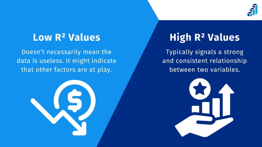
On the other hand, a low R² (say, 0.20) doesn’t necessarily mean the data is useless. It might indicate that other factors, such as external events or psychological drivers, are at play.
For example, a political opinion survey that shows a weak statistical correlation between voter age and candidate preference (R² = 0.20) might reflect the influence of recent news events or policy shifts that affect opinions beyond demographics.
You can also observe how R² changes over time. Imagine tracking satisfaction vs. revenue monthly, and early data might show an R² of 0.60, but as the business refines its offerings, the value climbs to 0.80.
This progression tells a story: your metrics are becoming more reliable indicators as strategies align with user behavior.
Case Studies: The Power and Pitfalls of R²
While R² can offer powerful insights, its true value comes to light when applied to real-world survey scenarios.
These two contrasting case studies show how R² can guide smart decisions, or mislead, depending on how well you understand the data behind it.
Case A: High R² in a Customer Retention Study
A national retail brand conducted a customer survey with 400 respondents to evaluate how satisfaction with its loyalty program influenced repeat purchases.
The result? An R² of 0.88 — a remarkably strong correlation.
This told the team that loyalty satisfaction was a key driver of retention. Based on this insight, they invested more in personalized rewards, and follow-up surveys confirmed the effectiveness of this strategy.
In this case, R² clearly validated a successful business decision.
Case B: Misleading R² in a Political Poll
A political research firm surveyed 600 voters to see how age predicted candidate preference.
The initial R² came in at 0.75, suggesting a strong age-related trend. However, a breaking scandal just days after survey launch dramatically shifted voter sentiment.
Follow-up analysis showed that the initial R² had been inflated by a temporary spike in opinions that didn’t hold. Without factoring in the external event, the survey data could have led to a flawed campaign strategy.
Key Takeaway
R² is a powerful lens, but it isn’t the whole picture. A high value doesn’t guarantee accuracy if the underlying data is unstable or skewed by short-term variables.
So, always pair R² insights with real-world context, like timelines, external events, and evolving user behavior, to ensure your analysis reflects reality, not just numbers.
How to Calculate R² from Survey Data
Understanding how to calculate R² empowers you to uncover meaningful patterns hidden in your survey responses.
While many tools can do this for you, learning the manual process helps you interpret results more effectively.
Step-by-Step: Calculating R² Manually
Here’s how to calculate r squared manually.
Step 1: Collect Your Survey Data
Let’s say you surveyed 10 users. You asked:
- Q1: “How satisfied are you with our service?” (1 to 5 scale) → Independent Variable (X)
- Q2: “How many times did you purchase in the last 6 months?” → Dependent Variable (Y)
Record your data in two columns.
| Satisfaction (X) | Purchases (Y) |
|---|---|
| 3 | 2 |
| 4 | 4 |
| 2 | 1 |
| 5 | 5 |
| 1 | 1 |
| … | … |
Step 2: Calculate the Mean of X and Y
Use the AVERAGE() function in Excel or Google Sheets.
- =AVERAGE(A2:A11) → Mean of X
- =AVERAGE(B2:B11) → Mean of Y
Step 3: Calculate the Regression Line (Ŷ = a + bX)
You’ll need two things:
- b (slope): =SLOPE(B2:B11, A2:A11)
- a (intercept): =INTERCEPT(B2:B11, A2:A11)
These give you your predicted formula: Ŷ = a + bX
Step 4: Calculate Predicted Y Values (Ŷ)
Use the formula from Step 3 to generate predicted values for each X.
- = a + b * X
Fill this down a new column for all 10 data points.
Step 5: Calculate the Total Sum of Squares (SST)
This measures total variation in Y.
- =SUMXMY2(B2:B11, AVERAGE(B2:B11))
This gives you SST (Total Sum of Squares).
Step 6: Calculate the Regression Sum of Squares (SSR)
This measures the variation explained by your model.
- =SUMXMY2(Predicted Y Range, AVERAGE(B2:B11))
Step 7: Plug into the R² Formula
- =SSR / SST
The result will be a number between 0 and 1.
- R² = 0.85 means 85% of the variation in purchases is explained by satisfaction scores.
- R² = 0.25 means only 25% is explained, likely other factors are at play.
Example
Let’s say you surveyed 200 customers on how likely they are to recommend your product (NPS score) and collected data on how much each spends monthly.
After plotting and running regression in Google Sheets, you find an R² of 0.76, meaning 76% of spending behavior can be explained by loyalty sentiment.
Don’t Skip the Data Prep
Before calculating R squared, always clean your data:
- Remove incomplete or irrelevant responses
- Normalize formats (e.g. consistent scale, remove outliers)
- Check for missing values
Proper data prep ensures your R² results are accurate and not skewed by errors.
Or Let Polling.com Do It for You
If manual setup sounds tedious, Polling.com simplifies the process. Its built-in analytics automatically calculate and visualize R² in real-time, so no formulas or spreadsheets required.
Just collect your responses, and the platform handles the rest.
Using R² to Track Trends Over Time
R² in survey analysis is a powerful tool for tracking trends in longitudinal survey analysis, revealing how well variables explain changes over time.
In monthly pulse surveys, for example, a company surveying 200 employees monthly on “How engaged do you feel?” (1–5 scale) might calculate an R-squared value of 0.75, showing workload strongly predicts engagement over months, guiding HR adjustments like flexible schedules.
In pre/post campaign surveys, a retailer assessing ad impact with “Did our campaign influence your purchase?” (Yes/No) could find an R² of 0.80, indicating ad exposure explains purchase intent.
Combining R² with time-series methods, like ARIMA models, enhances data analysis in survey by accounting for trends or seasonality. This makes survey analysis methods more robust.
When Not to Rely Solely on R²
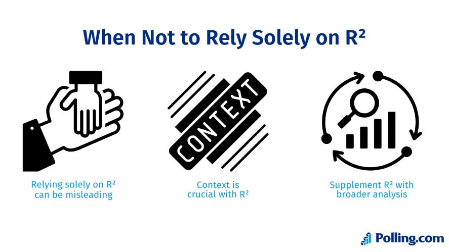
While R² is a powerful indicator of how well your survey data fits a model, it’s not the whole story.
Relying solely on R² without context can lead to misleading conclusions, especially in real-world survey research.
Common Misinterpretations
A high R² value might look impressive, but it doesn’t always mean your model is useful.
For example, you could find a strong correlation between unrelated variables (like ice cream sales and sunburns), but that doesn’t imply causation.
Similarly, a high R² in your survey analysis might reflect surface-level patterns while masking deeper, unmeasured factors.
Low R² Doesn’t Mean No Insight
Conversely, a low R² doesn’t mean your data is useless. In fields like social sciences, where human behavior is complex and influenced by many variables, an R² of 0.2 or 0.3 might still reveal a meaningful trend.
Instead of discarding the result, you can dig deeper into patterns, outliers, or sub-segments that might be driving interesting behaviors.
Go Beyond R²: Combine Quantitative and Qualitative Data
To get the full picture, supplement your R squared findings with:
- Open-ended responses that provide context to numeric trends.
- Cross-tabs and multivariate analysis to identify interaction effects.
- Segment-specific models to account for diversity in your respondent base.
By blending statistical strength with human insight, you’ll make smarter, more actionable decisions from your survey data without over-relying on a single number.
Comparing Survey Tools: How Polling.com Excels
Polling.com shines with advanced R² analytics and intuitive trend dashboards, streamlining data analysis in survey compared to SurveyMonkey, Typeform, and Google Forms.
SurveyMonkey offers regression analysis, including R squared value calculations, but only in paid plans, while Polling.com’s survey tools provide automated R squared calculation features and real-time visualization of trends like NPS shifts, surpassing Google Forms’ basic spreadsheet outputs.
Typeform’s focus on conversational, single-question flows offers basic reporting, whereas Polling.com’s predictive analytics forecast outcomes like churn risk from customer survey data, reducing manual work.
With Polling.com, you get faster, data-driven decisions through dashboards that simplify survey analysis results, turning how to do analysis of survey data into actionable strategies effortlessly.
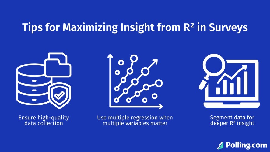
Tips for Maximizing Insight from R² in Surveys
To get the most value from R² in survey research, it’s essential to start with high-quality data. That means designing clear, focused survey questions and ensuring a sufficient sample size to avoid misleading results.
Vague or overly broad responses can introduce noise, making it harder for R² to reflect any real correlation.
When you’re analyzing outcomes influenced by multiple factors, such as customer satisfaction, onboarding experience, and pricing, consider using multiple regression models.
This allows you to isolate and quantify the influence of each variable more accurately, rather than oversimplifying the relationship.
Another strategy for improving insight is data segmentation.
Instead of treating all responses as a single data pool, break your analysis down by relevant cohorts like age groups, user tiers, or geographic regions.
While an overall R² value might seem weak, examining specific subgroups can uncover strong patterns that would otherwise be lost.
These approaches make R² a more reliable and meaningful tool in your decision-making process, especially when guiding product improvements, marketing strategies, or customer retention efforts.
Future of R² in AI-Driven Survey Platforms
As survey technology evolves, the role of R² is expanding beyond traditional regression analysis.
AI and machine learning models are now enhancing the accuracy and interpretability of R² by capturing more complex, non-linear relationships in the data.
This shift allows researchers and businesses to discover deeper patterns and correlations that might be missed by simple models.
Rather than just summarizing how well one variable predicts another, AI-powered regression engines can anticipate outcomes, flag emerging trends, and detect anomalies in real time.
Platforms like Polling.com are at the forefront of this shift. By embedding predictive analytics directly into the survey interface, it transforms raw response data into live forecasts and performance indicators.
This enables teams to react quickly, whether it’s spotting a rise in churn risk, identifying product pain points, or adjusting campaigns based on user sentiment.
As these platforms become more advanced, survey analysis will increasingly shift from being reactive to proactive.
Instead of waiting for insights post-launch, businesses will be able to optimize decisions in real time, all powered by smarter use of R² and predictive models.
Conclusion: Elevating Survey Analysis with R²
R² in survey analysis unlocks powerful trends, showing how well your survey data explains outcomes like loyalty or engagement.
For businesses, researchers, and campaign managers, combining R squared with segmentation and qualitative insights ensures analysis of data results drive impactful decisions.
Start using Polling.com’s analytics engine to see your R² trends live!