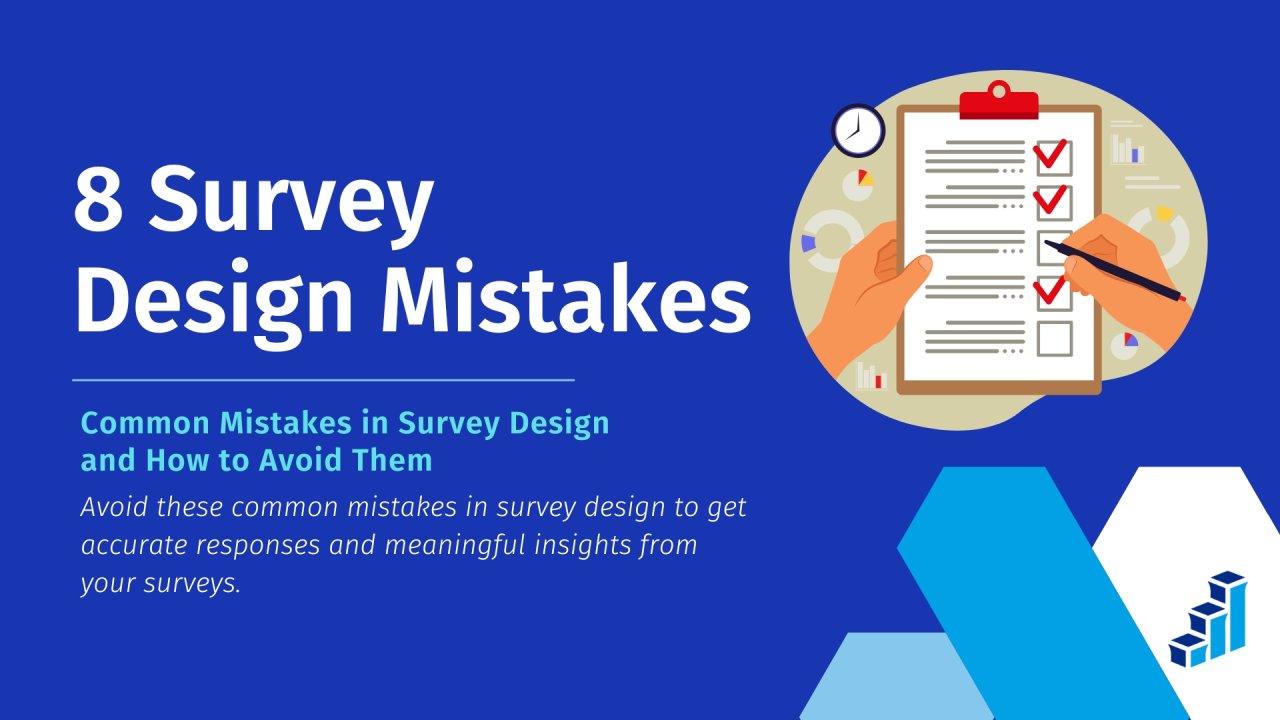
Common Mistakes in Survey Design and How to Avoid Them
Getting survey responses that actually mean something starts with how you design the survey. You mess it up, and your data is toast before you even analyze it.
What is a survey if not a tool to guide decisions? Yet, even when you’re trying hard to get it right, common mistakes in survey design can sneak in, throwing off your results and leaving you with skewed insights.
That’s why nailing the survey process matters so much. One mistake in how to create a survey can turn solid intentions into shaky outcomes.
Luckily, using a pro platform like Polling.com can steer you clear of these survey design mistakes, helping you build something that works and delivers trustworthy data every time.
Why Survey Design Matters
Good survey design isn’t just a nice-to-have, it’s the backbone of data you can rely on when taking a survey seriously.
A sloppy setup can lead to big problems with surveys, like skewed political polls that miss the mark or product strategies that flop because the feedback’s off-base, costing companies real money.
It’s all tied to how well the procedure of conducting an online survey holds up. If respondents don’t get what you’re asking or leave halfway, your data might be incorrect.
That’s where user experience kicks in. How to get survey responses hinges on making it easy and clear for them to answer, boosting response rates, and cutting out noise.
Issues with surveys, like what is the main problem with survey research, often boil down to this: bad design equals bad data, and that’s a risk you can’t afford when decisions are on the line.
Tools like Polling.com help here, smoothing out the how to make a great survey part so your results actually reflect reality.
8 Common Mistakes in Survey Design (and How to Avoid Them)
Nailing how to make a survey sounds easy, but common mistakes in survey design can trip you up fast. Here are the eight common mistakes to avoid so your data stays solid.
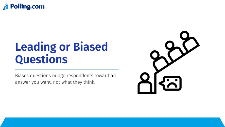
1. Leading or Biased Questions
One of the sneakiest survey design mistakes is asking leading or biased questions, like “Don’t you agree our product is the best?” or “How amazing was your experience?”.
These nudge respondents toward an answer you want, not what they think, and that’s a huge problem with surveys because it trashes your results’ honesty.
Biases in research like this invalidate data. For example, you’re taking a survey on customer happiness, and biased phrasing pumps up the positives, and you’ll end up with a rosy picture that’s miles from reality.
To avoid this, keep questions neutral. Swap “How great is our service?” for “How would you rate our service?”. It’s a simple fix in the survey process that lets respondents spill their real thoughts, cutting out the skew.
How can you avoid bias? Stick to facts, not feelings, and watch your wording.
2. Double-Barreled Questions
Double-barreled questions are another trap, like “How satisfied are you with our product and customer support?” It’s two questions mashed into one, and respondents don’t know which to answer, leaving your survey responses a mess.
The issue with surveys here is confusion, as someone might love the product but hate the support, so a single “Good” or “Bad” doesn’t tell you squat, muddying your data big time.
What is a potential problem with surveys in psychology? It’s mixed answers that hide the truth.
To fix it, split them up: ask “How satisfied are you with our product?”, then “How satisfied are you with our customer support?” separately.
That way, the survey stays clear, and you get clean, usable answers for each piece. It’s way better for figuring out what’s really going on.
3. Overly Long or Complex Wording
One big survey design mistake is hitting respondents with overly long or complex wording. It piles on cognitive load, making respondents’ brains work overtime, and that’s a fast track to survey fatigue where they just quit.
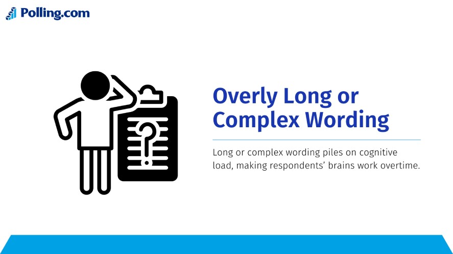
Complex surveys mess with your survey responses since people can’t parse the question, leaving you with half-baked data. To dodge this, keep the language simple and accessible.
It’s a key part of how to make a great survey: clear, short questions that don’t scare respondents off, so you get more complete answers in the survey process.
4. Poor Question Order or Flow
Poor question order or flow can tank your data too. Imagine asking “How was our support?” right after “Rate our product 1-10” when they haven’t even mentioned support yet.
Order effects and priming kick in here. That first rating primes respondents to think about the product, so their support answer might lean positive or negative based on it, skewing your results.
Biases in research love this flaw, as it’s a sneaky problem with surveys that twists what respondents say.
Best practices for logical sequencing fix it: start broad (How’s your overall experience?), then drill down (How was the product?), keeping the survey process smooth and natural.
How to avoid bias? Map your flow so each question builds on the last, not trips over it.
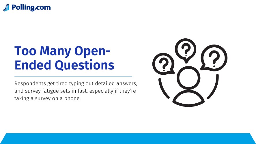
5. Too Many Open-Ended Questions
Loading up with too many open-ended questions, like “What do you think about this?”, five times in a row is a classic misstep that can sink completion rates.
Respondents get tired typing out detailed answers, and survey fatigue sets in fast, especially if they’re taking a survey on a phone. It’s one of those issues with surveys that cut how to get survey responses short.
What is the main problem with survey research here? You lose people, and your data’s incomplete.
So, use open-ended questions smart instead, like “What’s one thing we could improve?” after a yes/no question, keeping them sparse but punchy.
That’s how to create a survey that balances depth with doability, getting the most out of every respondent.
6. Lack of Clear Response Options
A big survey design mistake is leaving respondents with vague multiple choice options, like “How often do you use this? (Sometimes, Often, A Lot)”, or wonky scales that overlap, like “1-5 where 1 is bad and 5 is good, but 3 is okay”.
Respondents get confused, pick random answers, and your survey responses turn into noise, a classic problem with surveys that trashes reliability.
These unclear choices skew the data when people guess. To fix it, make options mutually exclusive and collectively exhaustive.
7. Not Considering Mobile Optimization
If you’re not thinking about mobile optimization, you’re asking for trouble, as half your respondents are probably taking a survey on their phones, and a clunky layout kills how to get survey responses fast.
Non-responsive design is a huge issue with surveys. A report says 43.5% of email opens are mobile, so if it’s not smooth, respondents drop off.
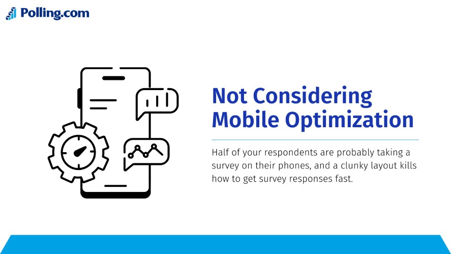
How can you avoid this? Use a responsive survey design that adjusts to any screen.
Polling.com’s got your back here. It ensures cross-device compatibility out of the box, so your survey process looks good and works everywhere, keeping those survey responses rolling in no matter the device.
8. Ignoring Survey Fatigue
Ignoring survey fatigue is a killer. Imagine pushing a 20-minute survey with no end in sight, and respondents bail before you get the good stuff, leaving your data half-baked.
A 5-10-minute survey is a sweet spot. Past that, and completion rates tank.
To avoid losing people mid-way, add breaks or progress bars, like “You’re 50% done!”, to keep them going.
How Polling.com Helps You Avoid These Common Survey Design Mistakes
So, how do you avoid these survey design mistakes and nail how to create a survey that works? Polling.com got your back with tools built to sidestep the mess.
First off, its smart design templates take the guesswork out of the survey process, whether you’re taking a survey for feedback or research, they’re pre-set to keep questions clear and logical, cutting down on junk like double-barreled traps or confusing flow.
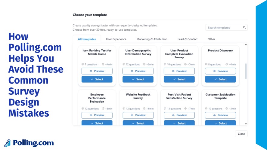
Plus, it’s got built-in bias checks, helping you avoid biases in research that skew your survey responses.
And when it comes to mobile? Polling.com’s mobile responsiveness is spot-on! Every question looks sharp and clickable on any device, unlike some clunky setups that lose respondents mid-way.
The UX optimization keeps things smooth too. Compared to SurveyMonkey, which offers tons of templates but can feel overwhelming, or Google Forms, which is free but skimps on advanced checks, Polling.com strikes a sweet spot.
It’s user-friendly, bias-smart, and cost-effective, giving you an edge in how to make a great survey without the headache.
Conclusion
The most dangerous survey design pitfalls can turn your data into a guessing game, and that’s a problem with surveys you can’t ignore.
Great surveys are your ticket to better decisions. Clean data means you’re acting on what respondents really think, not some warped version of it.
Want to skip the issues with surveys and get it right? Try Polling.com’s free survey builder! It’s your shot at crafting bias-free, spot-on surveys today that deliver the insights you need tomorrow.