Survey Branding and Theme Customization with Polling.com
Did you know that 71% of consumers expect consistent brand experiences across all digital platforms? That expectation doesn’t stop at your website or email campaigns; it extends to every interaction, including your surveys.
Survey branding refers to the visual and tonal elements that make your survey feel like a seamless extension of your company. That includes everything from the logo and color palette to the fonts and phrasing you use.
Today, great survey design examples aren’t just well-structured, but they’re instantly recognizable as belonging to a specific brand.
With growing competition for attention, what a survey looks like plays a significant role in response rates, perceived legitimacy, and overall user experience.
Whether you’re collecting customer feedback, launching internal polls, or conducting political research, survey branding can dramatically improve your survey responses.
That’s why platforms like Polling.com are stepping up. It not only offers theme customization tools today, but actively builds more advanced branding features in its roadmap.
From white-labeled links to design templates, Polling.com aims to help teams design surveys that don’t just collect data, but build brand trust.
What Is Survey Branding?
At its core, survey branding is about consistency and recognition.
It involves applying your company’s design identity to your surveys, ensuring they align visually and tonally with the rest of your digital assets. This includes:
- Your logo in surveys
- A consistent color palette
- Matching fonts and typography
- A cohesive brand tone or voice
- Optional enhancements like custom domains or white-labeling
A well-branded survey isn’t just about aesthetics; it has tangible benefits like:
- Builds trust: Users are more likely to complete surveys when they recognize the sender as a legitimate, professional entity.
- Reinforces brand recall: Every touchpoint reinforces who you are, even when you’re just asking a few questions.
- Improves completion rates: Familiar design elements can lower cognitive resistance and increase comfort.
- Enhances user experience: A branded, polished interface makes respondents feel valued and respected.
Whether you’re using free survey tools with branding options or enterprise-level software, the goal remains the same: make your survey part of your brand ecosystem.
The Psychology Behind Branded Surveys
Why does visual survey branding matter so much? It comes down to cognitive fluency, which is the ease with which users process information.
When a survey’s look and feel aligns with what users expect from your brand, it feels more trustworthy and less mentally taxing to engage with.
Color, typography, and tone all send subconscious signals. Here’s how:
- Blue communicates trust, often used in finance, tech, and government.
- Green signals growth, wellness, and calm, making it ideal for health, sustainability, and education brands.
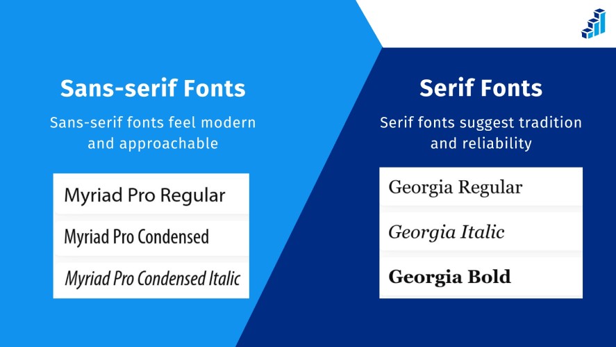
- Sans-serif fonts feel modern and approachable, while serif fonts suggest tradition and reliability.
- A friendly, conversational tone can make surveys feel more human, especially in B2C feedback forms or fun survey questions for casual engagement.
As noted by the Nielsen Norman Group, even subtle tweaks in UI and tone can impact user trust and behavior.
So, matching your survey design to your broader brand guidelines isn’t just a creative decision; it’s a psychological one too.
What Should a Branding Survey Look Like?
A well-designed survey isn’t just about collecting answers; it’s about creating an consistent brand experience that feels effortless, intuitive, and aligned with your brand.
The design of your survey can significantly influence how many people complete it, how honest their answers are, and the overall quality of your survey responses.
So what should a survey look like? Here are the foundational design principles that turn a standard questionnaire into an engaging, effective tool.
Clean, Uncluttered Layout
Surveys should be easy to scan and navigate. So, avoid cramming too many questions on one page.
Instead, use ample white space to reduce cognitive load and keep the visual focus on each question. A clean layout also signals professionalism, which increases trust.
Consistent Color Scheme and Typography
Incorporate your brand color palette and stick to 1–2 font styles for consistency. This reinforces brand identity and avoids visual confusion.
As seen in strong research design survey examples, colors should enhance readability and emotional response, not distract from the content.
Mobile Responsiveness
With more users responding on phones or tablets, mobile-first design is no longer optional.
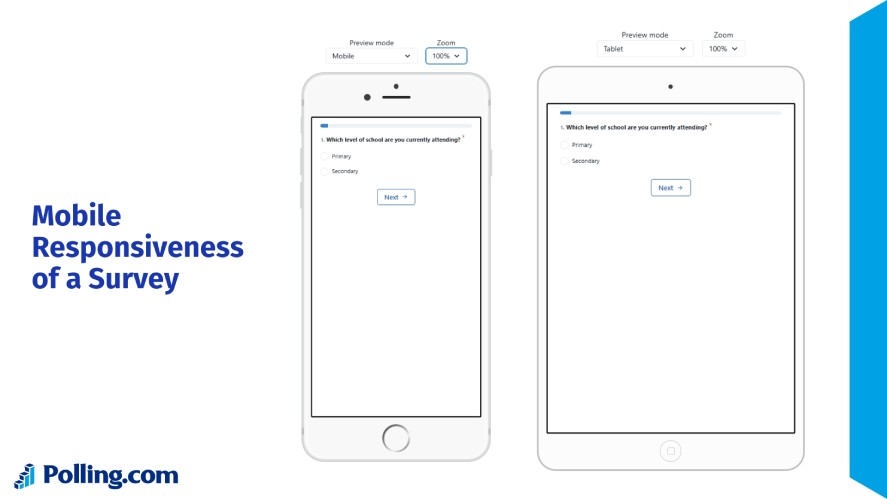
Buttons, text, and input fields must scale properly and remain easy to interact with across screen sizes. A mobile-optimized experience helps reduce abandonment and boosts completion rates.
Logical Question Flow
Group related questions together in a logical sequence. Also, use progress indicators to show users how far along they are, which helps reduce drop-off.
A well-structured flow respects the respondent’s time and encourages more complete answers.
User-Friendly Language and Tone
Let’s drop the corporate jargon and use a conversational, friendly tone that feels human, especially for fun survey questions or casual feedback forms.
A warm tone increases engagement and encourages more thoughtful responses.
Accessibility and Inclusivity
Surveys should be easy to use for everyone, including people using screen readers or assistive technology. Use high-contrast text, readable font sizes, and clearly labeled inputs.
This is essential not just for legal compliance, but also for gathering diverse, representative survey data.
Clear Calls to Action
Finally, make it obvious when users are done.
Buttons like “Submit” or “Next” should be clear, actionable, and easy to locate. Don’t leave respondents wondering what to do next.
Survey Branding and Theme Customization on Polling.com
Branding your survey doesn’t have to be complicated or costly. Polling.com currently supports a range of theme customization tools that let you make your surveys look and feel like a seamless part of your brand experience, right out of the box.
Users can easily:
- Customize survey color themes to match brand palettes
- Select fonts that reflect their company’s tone and visual language
- Choose from sleek, modern layouts that are mobile-responsive and easy to navigate
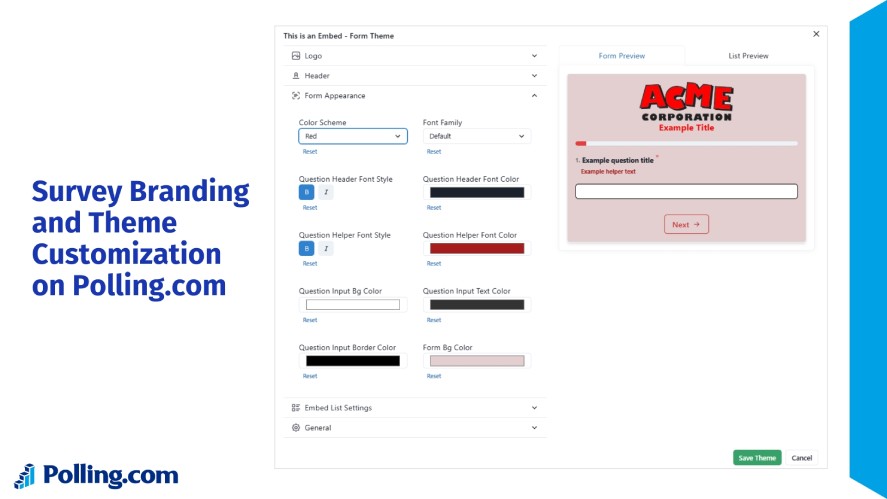
These features help reinforce a recognizable visual style while improving engagement and professionalism.
Whether you’re running internal polls or customer-facing branding questionnaires, a well-branded interface encourages more authentic participation and higher survey response rates.
And the best part? These customization options are included in the standard Polling.com plan, no pricey upgrades or enterprise tiers required.
Bridging the Gap: Branding Features on Polling.com’s Roadmap
While Polling.com offers strong theme customization today, some advanced branding options, like logo uploads, custom end screens, and white-labeled survey domains, aren’t available just yet.
But they’re on the radar. These features are among the most frequently requested by users, and the Polling.com team is actively exploring ways to bring them to life.
As a platform that grows in response to community needs, Polling.com is committed to evolving alongside its users.
If you’re excited about these upcoming tools, you can:
- Join the waitlist for branding features
- Submit feedback directly to help shape what’s built next
- Sign up for feature updates to stay in the loop as they roll out
Polling.com isn’t just a survey tool; it’s a product shaped by the people who use it.
How Polling.com Compares to Other Platforms
Below is the feature comparison table focusing on pricing, current theme customizations, and potential future enhancements of Polling compared to other popular platforms.
| Feature | Polling.com | Google Forms | SurveyMonkey | Typeform |
|---|---|---|---|---|
| Theme Customization | Yes (Standard plan) | Limited | Yes (Enterprise plan) | Yes (Plus plan) |
| Logo Upload | Yes (Standard plan) | Yes | Yes (Advantage plan) | Yes (Basic plan) |
| White-label Domain | Limited | No | Yes (Premier plan) | Limited |
| Branded Templates | Limited | Yes | Yes | Yes |
| Ease of Use | Easy & Fast | Easy & Fast | Moderate | Moderate |
Use Cases for Survey Branding and Theme Customization
Survey branding isn’t just for marketing teams; it’s a cross-functional advantage that can benefit customer experience, internal culture, and data reliability.
By using consistent visual and tonal elements in your surveys, you strengthen credibility and drive more meaningful responses.
Here’s how different teams can leverage theme customization features right now.
Customer Feedback Surveys
Customers are far more likely to engage with surveys that look and feel familiar.
When the branded survey design reflects your brand using your logo, colors, or fonts, users feel more confident that their feedback is going to the right place.
Here’s how branding helps:
- Builds trust: Visual consistency reassures users that the survey is official.
- Improves response rate: A branded experience feels intentional, not generic.
- Aligns with user expectations: Branding tells users that you care about presentation, and by extension, their opinions.
Tip: Use your primary brand colors as the base theme and write in a voice that mirrors your customer support tone.
Internal Employee Engagement Surveys
Your employees know what your internal brand feels like. From onboarding materials to Slack emojis, company culture is visually and tonally expressed.
When you align your employee surveys with that culture, engagement and honesty improve.
Why this matters:
- Employees are more likely to take surveys seriously if they look official.
- A consistent design supports a culture of open communication and transparency.
- Reflecting internal tone (e.g., casual vs. corporate) helps build psychological safety.
Tip: Use your internal brand guidelines, not just external ones, to guide color themes, fonts, and language choices.
Campaign or Event Surveys
Surveys tied to seasonal campaigns or live events benefit greatly from on-brand aesthetics.
Whether you’re collecting feedback after a webinar, conference, or limited-time offer, the right visual style reinforces brand presence and improves recall.
What this accomplishes:
- Strengthens event identity: Use campaign-specific and custom survey themes to align with the event’s design.
- Improves response accuracy: Users are more context-aware when visuals match the event.
- Boosts professional perception: A polished look reflects positively on the brand or event organizer.
Tip: If you can’t include logos yet, choose a theme that mirrors your campaign design language (e.g., bold fonts for tech events, soft tones for wellness brands).
Best Practices for Branded (or Theme-Aligned) Surveys
Even without access to full branding tools like white-labeling or custom URLs, you can still create branding surveys that feel deeply aligned with your organization’s identity.
These best practices ensure a branded experience that builds trust and enhances response rates using the tools available today.
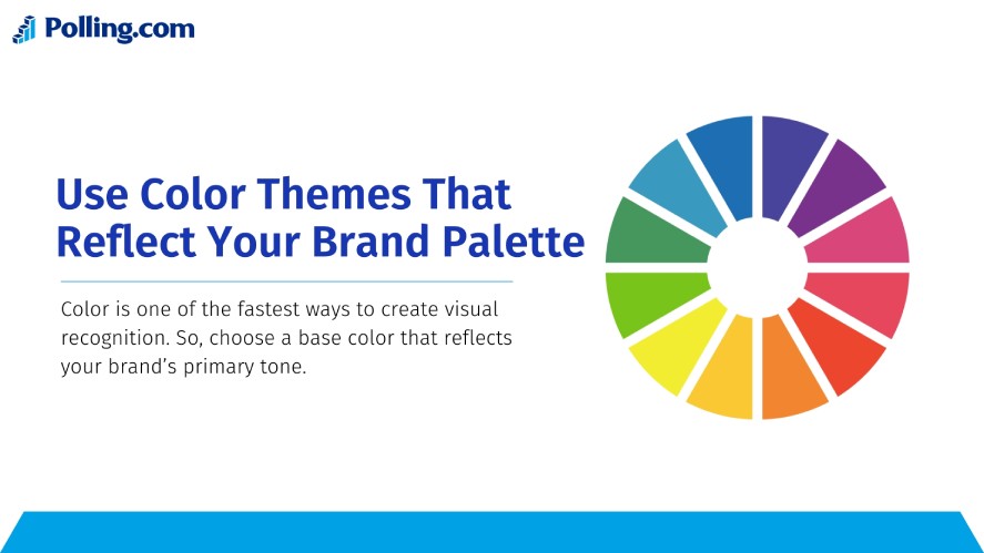
Use Color Themes That Reflect Your Brand Palette
Color is one of the fastest ways to create visual recognition.
So, choose a base color that reflects your brand’s primary tone and use complementary hues that mirror your website, branded surveys app, or marketing materials.
Here are a few tips:
- Stick with 1-2 main colors to avoid clutter
- Ensure contrast is readable for accessibility
- Avoid using colors that conflict with your brand (e.g., red if your brand is associated with calmness)
Select Fonts That Reflect Brand Personality
Fonts convey tone, whether your brand is playful, formal, or tech-driven.
While most survey tools limit font options, pick the one that most closely matches your website or customer communications. For example:
- Sans-serif fonts (like Roboto or Open Sans) convey modern, approachable design
- Serif fonts (like Georgia or Merriweather) imply tradition and professionalism
Lastly, avoid switching font styles between brand survey questions and pages to ensure consistency.
Maintain a Consistent Brand Voice
Your survey tone should reflect the same personality your customers or employees are used to.
Tone tips:
- Avoid robotic or overly technical language
- Use everyday phrases your users are familiar with
- Personalize where possible (“Hi Alex, we’d love your thoughts”)
Whether it’s friendly and casual or professional and neutral, keeping your brand voice consistent improves engagement and reduces cognitive friction.
Customize the Intro and Thank-You Pages
The beginning and end of a survey are critical touchpoints. So, use these pages to reinforce your brand’s mission and appreciation in your voice, even if you can’t add a logo yet.
On the intro page, greet the respondent warmly and clearly explain the purpose. On the thank-you page, express gratitude and explain how their input will be used.
Include Personalized Elements (If Supported)
Personalized surveys feel more human. If your platform supports it, dynamically insert respondent names, previous interactions, or segments to tailor the experience.
Examples:
- “Hi Jordan, thanks for attending our Q2 Summit — we’d love your feedback.”
- “We noticed you recently joined our team — help us improve onboarding.”
Stay Mobile-Friendly and Accessible
Design with inclusion in mind. Branded or not, your survey must be:
- Easy to read on phones and tablets
- Keyboard-navigable
- Compliant with color contrast and font size standards
Remember, good branding is inclusive branding.
Test Survey Branding Before Sending
Before distributing, preview your survey across devices.
Check how your theme colors and fonts look on small screens, how readable your questions are, and whether your tone flows naturally.
Pro tip: Ask someone unfamiliar with your project to take it. If they’re confused or visually overwhelmed, adjust before going live.
Final Thoughts: Aligning Design with Purpose
In the world of online surveys, survey branding isn’t a bonus; it’s a trust signal.
Whether you’re collecting insights from customers, employees, or event participants, aligning the look and feel of your survey with your brand helps drive better response quality and participation.
Polling.com already offers flexible theme customization tools that let you take control of survey aesthetics today with more branded survey features on the way. The platform is actively listening to users and plans to expand into more branded survey capabilities soon.
Start creating professionally styled surveys with Polling.com — and stay tuned for even more branding options coming soon.
